|
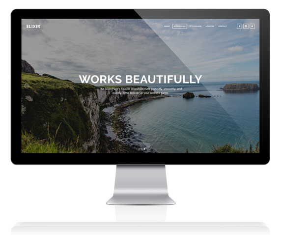
A Beautiful, Responsive Header SliderWe developed a beautiful responsive full-screen header slideshow that is simply stunning. It runs on CSS3 only, and avoids any jQuery which means you'll be guaranteed a smooth, fluid experience. The slideshow automatically optimizes all the images you upload for the best look and feel, and offers adjustable filters letting you optimize your slideshow images for best readability and contrast.
Easy to Use · Responsive · Automatic Optimization · Pixel-Perfect
|
Runs on Pure CSS3, No jQuery or JavaScript!If you don't know what this means, don't worry about it. What it means is your slideshow is running on the latest code, cleanly optimized for all kinds of devices. For non-techie beginners, the slideshow is a breeze to edit and replace with your own images. For our more experienced folks who want to modify certain parts of the slideshow, we have annotated the code, giving you the power to meet your or your clients demands. If you ever get stuck, our customer support will help you with the custom code for the slideshow!
Easy to Edit · Annotated · Great for Beginners and Experienced Users
|
|
100% Responsive, Looks Great Everywhere
Just like all of Elixir, SliderPage and its slideshow is 100% responsive. We crafted the slideshow to be smart, and automatically adapt to the configurations of the users screen size. This means that your website will look beautiful on any device. Some developers like to take the "easy" way out and make the slideshow disappear on mobile devices. We didn't want to do this, and we devised a solution to make the slideshow adapt to mobile devices.
Adaptable · Efficient · Smart · Compatible Everywhere